Redesigning Twitch's Developer Docs Homepage
Table of Contents
A redesign of Twitch's developer docs homepage—backed by user research!
Introduction
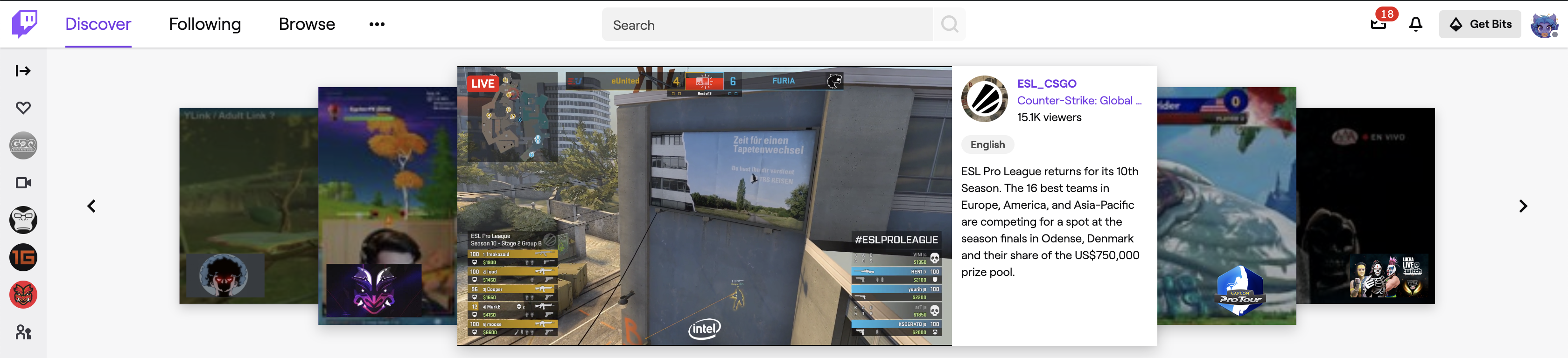
Almost every gamer, from competitive to casual, has heard of Twitch. Founded in 2011, the streaming site has seen an immense rise in popularity over its lifetime, driven largely by its decision to focus on video games and e-sports.
Twitch's explosion, and subsequent 2014 acquisition by Amazon, has inspired a slew of competing products from other major companies, including YouTube Live, Facebook Gaming, and Microsoft's Mixer. Twitch's head start and lineup of star streamers has kept them in a lead by a wide margin. As time goes on though, competing services will lure streamers and viewers to their own platforms, and Twitch may find themselves losing market share.
In order to prevent a gradual exodus, Twitch needs to create and focus on key differentiators. What could make them stand out more than a passionate community of contributors? Twitch has begun developing a rich ecosystem of tools allowing third-party developers access to modify the viewing experience. For example, Twitch Extensions allow viewers to be more than a passive part of the stream. Extensions can be used to provide information about the game, such as what equipment an on-screen character has; direct the stream via voting on things like what game the streamer plays next; or even manipulating the game being streamed itself.
Thesis
I believe a world-class developer experience is Twitch's best shot at maintaining market share and creating a stellar user experience, and the first step in creating that is amazing documentation. Giving developers a great documentation experience acts as a multiplier. If you enable them to build innovative experiences quickly and easily, they will—and then, they will passionately evangelize your documentation and platform to others.
Finally, the core of any streaming site is its community. Helping developers create unique and interactive experiences is a critical component of supporting the currently vibrant community on Twitch. Let's see what we can do to enable that!
Initial Review
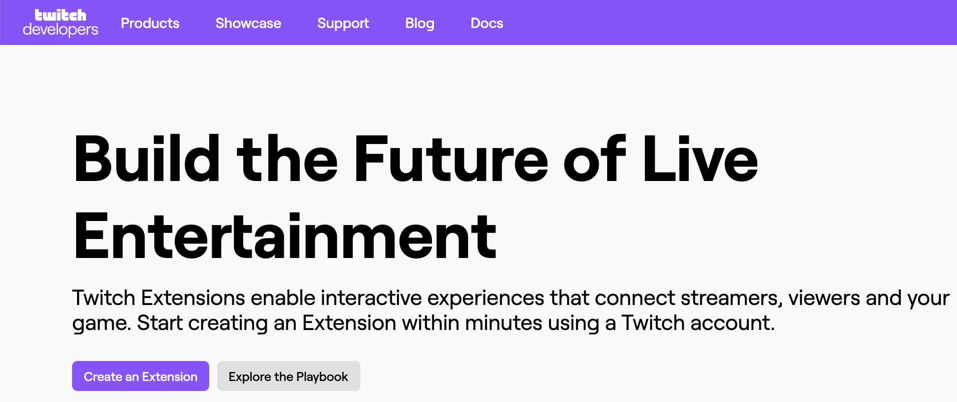
I started out by reviewing the information architecture (IA) of Twitch's Developer Hub. A solid IA will allow users to easily form a mental map of your site and find the information they need with minimal fuss. Especially for larger sites that cater to a variety of topics and personas, like the Developer Hub, it's critical to get users to the right content fast. I did this by creating a site map laying out how pages were linked together, and marking which pages were marketing content vs technical content. After reviewing that, I moved on to an analysis of the overall user experience.
Although the Developer Hub does many things right, I quickly discovered that there are also many areas with room for improvement.
- The top level navigation is too sparse. There are just a few (5) navigation options, and they're all broad and vaguely described. The first 2 (Products and Showcase) give minimal information to users as to what information might lie there. Additionally, the navigation is not prioritized or organized in any way that helps users understand what to focus on.
- Developer content and marketing content co-exist on the page, but not peacefully. Marketers or producers won't benefit from the numerous links to API documentation, but developers are likely to get lost in the flash of the page and bounce away. Twitch provides ample information for both parties, but intertwines them without providing a way to distinguish between the two. (This came up as a recurring theme during my user research.)
- Content is hard to find. Top tasks were not made readily apparent or appropriately represented in top spots. The page feels very vague on the whole.
- Links do not align with common user expectations. For example, the "Create an Extension" CTA on the Developer Hub homepage leads to the screen to set up a brand-new extension, rather than documentation about what extensions are or why you might want to create one at all. While this link text is technically correct, it is not in keeping with user expectations—the chances that anyone on an introductory page will be ready to jump in without documentation are very low. This hurts user trust and may lead to increased bounces.
After reviewing the Developer Hub, I zoomed in on Twitch's developer documentation landing page. (There were other areas of the site I could have reviewed instead, but as my background is in programming and the documentation is very important, it was a natural choice.) Here again, I saw similar issues as on the Developer Hub.
- The page lacks strong direction for new users. Several different paths are immediately presented, with equal importance placed on all of them. Although this is helpful for users who are return visitors or know what they want, it may not help those who are new to the ecosystem and looking for more guidance.
Space on the page is not well used. The second section on the landing page ("Quick Links") consists of 4 eye-catching purple buttons. 2 of those buttons go to the same docs page, which is already the second item in the page table of contents (TOC) and therefore quite prominent to begin with; 1 goes to the changelog for the documentation, which is an odd and minimally useful choice; and 1 goes to a code sample gallery that's on another part of the site entirely. None of these links deserve the visual prominence afforded to them.
The third section on the page, “Explore Twitch”, is a particularly bad use of space. This section reiterates the TOC headers with a short description of each. This effectively creates a second TOC that would be entirely unnecessary if the TOC was better-structured. Similarly...
The TOC is poorly structured and hard to use. Many of the category names are vague, and there's no way to preview more information about the documentation in a category without clicking on it. The ordering of topics feels random.
- Content and links are needlessly duplicated. For example, a "Support" link appears 3 times in the page chrome (header, banner above footer, and footer), in addition to a "Getting Help" section on the page itself. 1 discoverable link would suffice.
Of course, there are many things Twitch did right on both of these pages. They're visually appealing, with a clean design and snappy UI elements, and they contain a lot of useful information if you take the time to investigate. But for purposes of this study, we're going to instead focus on what they did wrong. :)
We have plenty of areas we can dive into. But where should we start? To find out, let's do some user research!
User Research
The first step in understanding how to improve the state of Twitch's documentation is to understand how people view and interact with it today. To that end, I interviewed 3 prospective users.
- All were technology professionals.
- 2 were developers; 1 was a DevOps engineer.
- 2 were casual viewers of Twitch; 1 was a former streamer and stream engineer.
- Nobody had previously programmed anything on Twitch's developer platform.
The interviews started with a quick discussion to assess technological background and prior Twitch usage. After establishing that context, we moved on to 2 tasks.
- Starting on dev.twitch.tv, I asked users to pretend they had come to this site looking for information on how to build a Twitch chatbot and observed their behavior.
- Starting on dev.twitch.tv/docs, I asked users to pretend they had come to this site looking for information on how to build a Twitch Extension and observed their behavior.
After completing these 2 tasks, I asked:
- On a scale of 1-5, how easy was it to find the information you were looking for?
- On a scale of 1-5, how helpful did you think the content you found was?
- On a scale of 1-5, how visually appealing did you find this website to be?
- Any other feedback or thoughts?
Research Summary
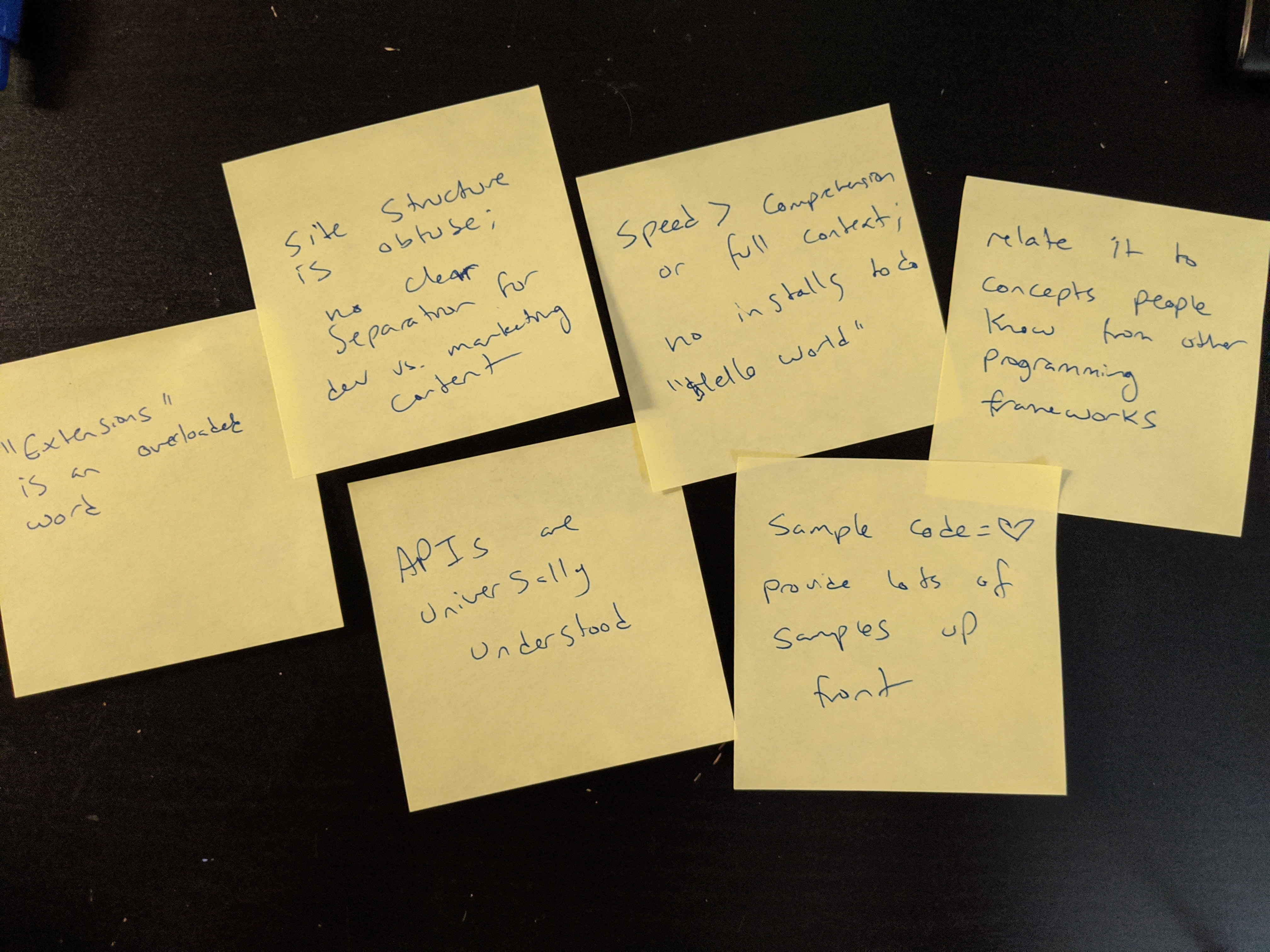
After the interviews, while the content was still fresh in my mind, I summarized and grouped recurring themes via sticky notes. Of the 3 interviews I did, 2/3 completed the chatbot task, while 3/3 completed the extension task. However, all experienced friction using the site, and struggled to navigate the intermingled marketing and developer content.
Recurring themes:
- "Extensions" is an overloaded word; nobody understood its meaning and Twitch's materials did a poor job defining it
- Site structure is obtuse; though developer content is not deeply buried, it is also not immediately discoverable which presents a poor starting experience for new devs
- APIs are universally understood among devs and are often the first place a dev will look for context
- The desire to get up and running quickly outweighs the desire to have a lot of background information—code first, ask questions later (or as the questions arise)
- Most devs are willing to install a new tool to get a basic "Hello World" example running, but need to be somewhat invested in the project first
- Devs gravitate towards code samples and "Hello World" projects over long paragraphs of text
- Devs often try to orient themselves by relating new programming concepts to ones they're already familiar with
(Some of these points are not developer-specific or particularly novel insights, but are still worth explicitly calling out as they occurred across all 3 interviews.)
The ratings users provided for the questions were:
- On a scale of 1-5, how easy was it to find the information you were looking for? 2, 4, 5 (average = 3.6)
- On a scale of 1-5, how helpful did you think the content you found was? 3, 4, 4 (average = 3.6)
- On a scale of 1-5, how visually appealing did you find this website to be? 3, 3, 5 (average = 3.6)
You can also read the raw notes from these interviews.
Based on these user interviews and my prior knowledge of the problem space, I chose to focus on improving the developer documentation homepage. I chose this page because it's a critical entry point for casual converting website visitors into devoted Twitch developers. You only get one chance to make a first impression that wows developers with your platform and documentation!
Redesign Process
Design Principles
I focused my redesign on the principles of clarity, cleanness, consistency, and direction. Text should be clearly written, the design should be clean and easy to skim, links should lead to consistent types of pages, and the overall structure should be directed and focused on guiding users to the best available content.
Personas
I created 3 personas to refer back to during the redesign process. They capture both devs and non-devs with a range of experience and goals.
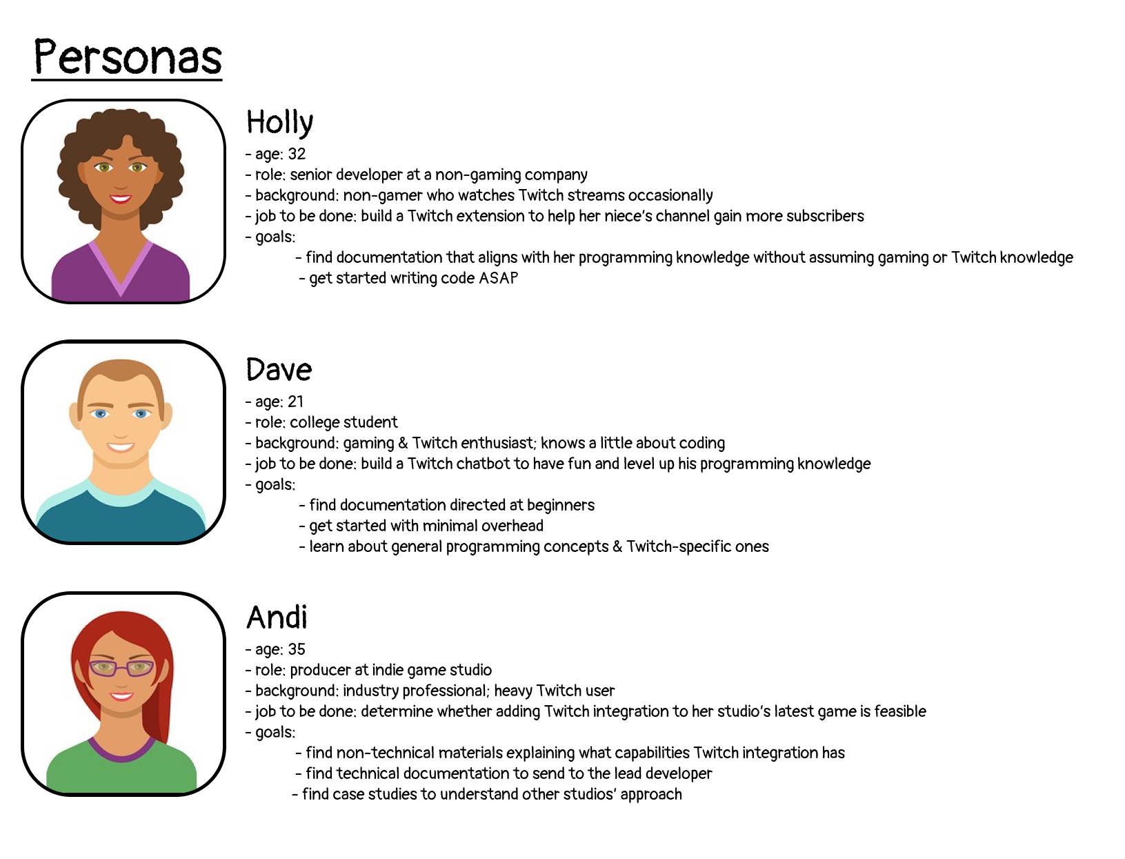
a list of our personas (click to view on Figma)
Now, with these personas and principles in mind, let's get to executing!
Execution
My redesign was inspired by a card-based structure. This model has been a popular design choice for several years for a number of reasons which I felt aligned nicely with my goals for this work.
- Cards break down content into small, digestible chunks, providing structure for people creating pages, and structure for users to quickly scan those pages.
- Cards are visually appealing, and can be modified to fit a variety of content.
- Cards avoid walls of text, which is important on introductory pages.
- Cards play nicely with grid layouts and are easy to make responsive (though I didn't create a responsive page as part of this work, it's always good to keep mobile users in mind).
Cards do have some downsides. If too many are used, the page will become visually monotonous and harder to scan. To combat this, I created a few different styles of cards, representing highlighted content, allowing the use of icons, or integrating other design changes to keep the page feeling fresh. (Not all of the card styles I developed are represented on the final page—you can view the Figma file to see them all.)
I chose to focus on content that aimed to get developers started quickly. Ideally, this page redesign would be rolled out in conjunction with a redesign of Twitch's Developer Hub that immediately redirects developers to it.
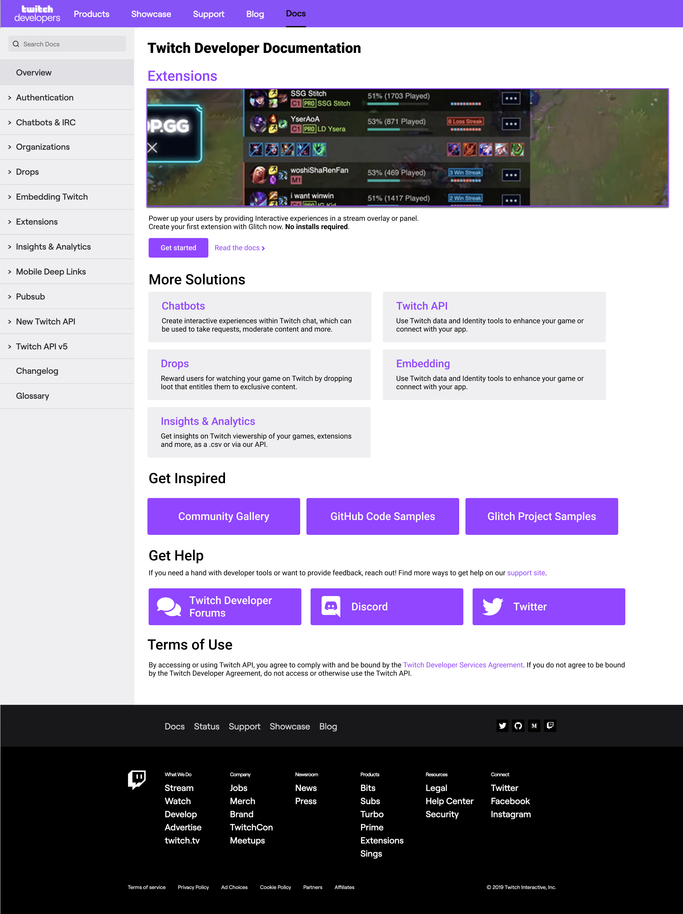
Final Concept
Redesigned
Current
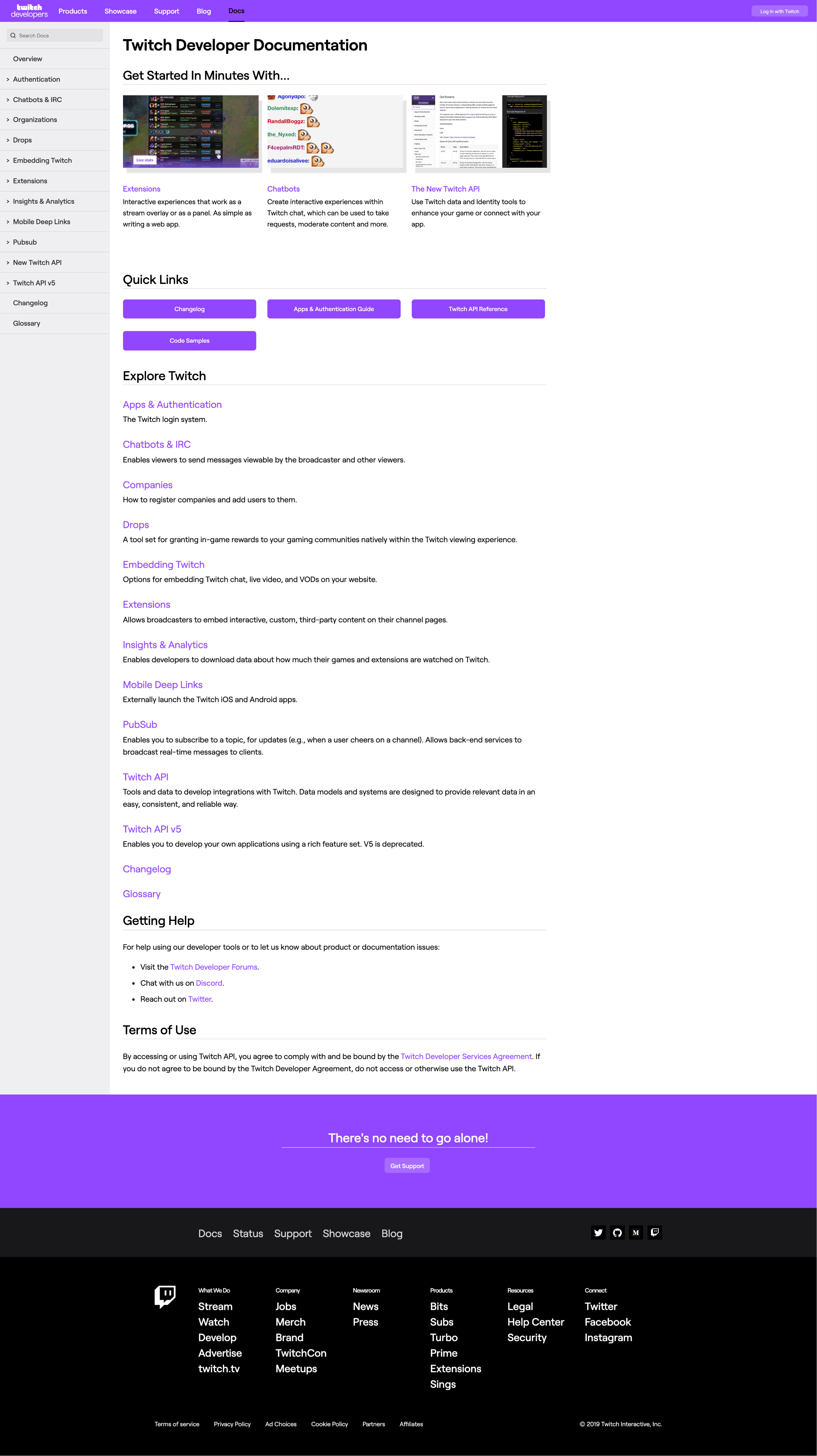
(click to view on Figma, then use left/right arrow keys to compare the two)
Highlights:
- Content has been rewritten throughout the page to orient users and explain Twitch lingo when it's introduced
- Clear guidance and visual priority is placed on Extensions, which seems to be Twitch's top developer task
- The primary “Get started” CTA links to an interactive, step-by-step tutorial targeted at beginners that requires no downloads (and says so upfront!)
- “Read the docs” links to an Extensions overview page, targeted at more experienced developers
- “More Solutions” offers a taste of Twitch’s capabilities while not overwhelming the user with choices
- A 2 column layout condenses information for better scanning
- Content is broken down into logical categories
- Links are reorganized, de-duplicated, and reworked to surface more relevant and interesting pages
There were several other areas I wanted to tackle but ultimately decided were out of scope:
- Reworking the documentation TOC structure
- Reworking the IA and top nav of the overall Twitch Developer Hub
- Designing a way to distinguish between marketing and developer content
- Creating more engaging "Get Started" tutorials
and much more...
Wrap-Up
Many caveats apply to this work! This was a time-constrained redesign done as someone completely external to the Twitch organization. While I'm proud of this work and think it has real benefits to offer, I'm of course not partial to Twitch's internal dialogue or decision-making process. Chesterton's fence always applies—don't tear down a fence until you know why it was built.
I also wasn't able to work off any significant amount of data to drive these design choices, so many things in here are driven by my opinion and prior background knowledge on the subject. I was only able to conduct 3 user interviews, and of course, did not have access to any of Twitch's internal metrics. If I were working on actually building this, I would significantly increase the number of user interviews, do usability studies and/or A/B tests on various designs, and deeply engage with the business stakeholders to build consensus on what problems we're facing and how we want to approach them. (And of course, loop in a trained designer!)
Finally, this is one of many improvements that could be made to Twitch's developer experience. Although I believe this would have a noticeable impact, there are so many other places we could investigate (like overhauling the main Developer Hub, or creating a community outreach program, or building a set of tutorials, or...). I look forward to seeing what the folks at Twitch decide to focus their efforts on in the future.
Return to top ↵